In my last post, we took the 380+ game video game attributes that we extracted from the Steam video game dataset and wrote an algorithm to cluster the attributes into 24 groups. In this post we will use the clusters to make an new and improved video game recommender. If you haven’t read my first and second post on the video game recommender, please read them before continuing.
Step 1: Reconstructing the game features table
The game features table that we built in the first post contained hundreds of attributes. We will construct a much smaller table using the game attribute clusters.
Game Features Table
The each column in the table indicates the magnitude of that attribute present in each game. The numbers are computed for each game using the attribute-cluster assignments we obtained from K-means. For each game, we count up the number of attributes that belong to each cluster. The construction of the new game features table is described in the code snippet below.
This file contains hidden or bidirectional Unicode text that may be interpreted or compiled differently than what appears below. To review, open the file in an editor that reveals hidden Unicode characters.
Learn more about bidirectional Unicode characters
Using the game features table we built in step 1, we will rebuild a much smaller user features table.
User Features Table
Similar to the game features table, each column in the user features table indicates the degree each user prefers a game with that attribute. The numbers are computed for each user by retrieving the features for each game played by the user from the game features table and adding them up.
This file contains hidden or bidirectional Unicode text that may be interpreted or compiled differently than what appears below. To review, open the file in an editor that reveals hidden Unicode characters.
Learn more about bidirectional Unicode characters
With our new game and user feature tables in place a new method for examining similarity between users is in order. In our first recommender, we used the matching dissimilarity score. In our new recommender, we’re going to use cosine similarity. Cosine similarity is a measure of similarity between two numerical vectors. It is the dot product between two vectors divided by the product of their lengths.
Let’s suppose that we have a user that we want to generate recommendations for. We’ll call the user in question u and the number of recommendations we’d like to generate x. We will use cosine similarity to find another user named v who’s preference is the most similar to u. We will then select x games from v‘s play history that has not been played by u and then recommend them
Here’s the new recommendation procedure in code form.
This file contains hidden or bidirectional Unicode text that may be interpreted or compiled differently than what appears below. To review, open the file in an editor that reveals hidden Unicode characters.
Learn more about bidirectional Unicode characters
In a previous blog post, I walked through the creation of a simple recommender system that recommends video games to existing users on Steam. Since creating the recommender, my student and I have been exploring ways to improve it. One enhancement we’ve been looking at is speeding up the computational time of the recommender by clustering video game attributes (tags, genres, and specs) into smaller, more manageable groups. In this post I will describe how we utilized the K-means algorithm to do this.
Improving the Recommender by Computing Probabilities
The current system uses 188 categorical attributes to recommend video games to existing users. The biggest disadvantage of this approach is the large amount of computational time required to build the tables the recommender requires. The numerous categorical features also makes adding numerical features (such as game price) to the system challenging; the influence of the categorical features will outweigh any impact the numerical features could have on the recommendations. To correct both issues, we will attempt to reduce the number of attributes the recommender using K-Means clustering.
The raw, unprocessed video game metadata contains 380+ attributes. We observed from looking at the data for several video games that some attributes tend to appear together with other attributes. This gave me the idea to try to group these attributes based on the likihood the attributes will appear together. We will do this by constructing a square matrix that contains the conditional probability of observing any two attributes in a video game. We use this matrix to cluster the game attributes.
The code snippet below shows the construction of the probability matrix. We iterate through the each game in the steam games dataset and construct a dictionary containing the sets of games that have each attribute.
This file contains hidden or bidirectional Unicode text that may be interpreted or compiled differently than what appears below. To review, open the file in an editor that reveals hidden Unicode characters.
Learn more about bidirectional Unicode characters
We use the attributes dictionary to build the probability matrix.
This file contains hidden or bidirectional Unicode text that may be interpreted or compiled differently than what appears below. To review, open the file in an editor that reveals hidden Unicode characters.
Learn more about bidirectional Unicode characters
The probability matrix computed in the last section has 381 dimensions. As discussed in my high dimensional clustering post, clustering data with very high dimensions could be problematic. To avoid these problems, we’re gonna apply dimensionality reduction.
The code snippet below uses the pca module provided by Sci-kit learn to perform Principal Component Analysis on the probability matrix. To determine the number of principal components to keep, we computed a cummulative sum of the explained variance ratios for each principal component. Check out my article on PCA for more details on how it works.
pca = PCA()
pca.fit(probability_matrix)

total = 0
for idx, r in enumerate(pca.explained_variance_ratio_):
  total += r
  print("{0} Components: {1}".format(idx, total))
We decided to keep just enough components to explain 70% of the variability in the data. That number happened to be 31. We will refit PCA to the dataset and reduce the dimensions.
# Refit PCA to the probability matrix and keep only the 31 principal components
pca = PCA(n_components=31)
pca.fit(probability_matrix)
feature_set = pca.transform(probability_matrix)
With the newly featurized dataset in place, we can now proceed with the data clustering.
Discovering Game Attribute Categories
We use the sihoulette method to find the optimial number of clusters for k-means. The code snippet below uses the Sci-kit learn implementation of k-means and silhouettee score to derive scores for different numbers of clusters. Check out this post for details on how the sihouette method works.
range_n_clusters = range(2, 28)

for n_clusters in range_n_clusters:
    clusterer = KMeans(n_clusters=n_clusters, random_state=25)
    cluster_labels = clusterer.fit_predict(feature_set)

    silhouette_avg = silhouette_score(feature_set, cluster_labels)
    print(
        "For n_clusters =",
        n_clusters,
        "The average silhouette_score is :",
        silhouette_avg,
    )
Using the snippet above we determined the optimal number of clusters to be 24. Last, but not least, we group the game attributes into 24 clusters and output the group assignments.
This file contains hidden or bidirectional Unicode text that may be interpreted or compiled differently than what appears below. To review, open the file in an editor that reveals hidden Unicode characters.
Learn more about bidirectional Unicode characters
K-means does a pretty good job with grouping attributes into meaningful clusters. One downside you might notice that the cluster assignments will not be consistent when the snippet is run subsequent times. Because the initial centroids used by K-means are choosen at random, we will get different cluster outputs on the same dataset. We can work around this issue by performing the clustering several times and choosing the results that have the lowest sum of squared error.
That’s all folks!
In my next post, we will use the attribute clusters to make a new version of the recommender. We will then explore methods for evaluating how good of a job our recommenders do with recommending video games to users. You can find the code for the entire solution here.
High dimensional data are datasets containing a large number of attributes, usually more than a dozen. There are a few things you should be aware of when clustering datasets such as these. The goal of this post is to highlight a few strategies you can use when performing high dimensional clustering.
Setting the Stage
To set the stage for the discussion take a look at the image below.
Which one of the red points would you say is the closest to the x in the center? As you can see, there’s no clear answer. Some of you reading this may even say that is a nonsensical question to be asking, because these points are roughly equidistant from x. Even if there is a single point that is closer than the others, it would only be by a measly, negligible amount.
When a data clustering algorithm looks at high dimensional data, the data points could look much like the above image. The results we get back from the algorithms may not capture the patterns present in the dataset. This is known in machine learning as the curse of dimensionality.
Dum Dum Duuuuuuuuumm… The curse of dimensionality
The curse of dimensionality is a very interesting, and counterintuitive phenomenon that arises when machine learning algorithms are applied to datasets with a large number of features.
Data clustering algorithms work by computing distances between data points and grouping together points that are close together in proximity. When the number of features in a dataset is small, the algorithms are able to clearly the data points that are close together from the ones that are not. For datasets with many features, the task of identifying points that are closer together is more challenging. The reason for this is because the distance between points in high dimensions are far away. This is true even for points that are similar to each other.
Pictured below are two charts. The chart on the left is a 1-dimensional plot of several data points. The chart on the right is a histogram of pairwise distances between each data point pictured in the first plot.
As shown in the plot on the left, the dataset can be neatly grouped into three clusters. You can also see this from the three peaks in the histogram on the right.
Here’s what the charts look like when we add a second dimension to the data.
With the addition of the second dimensions, the distances between each point is larger. Nevertheless a clustering algorithm can still easily cluster these points into 3 groups.
The same observation can be made if a third dimension was added to the data.
As more dimensions are added to the dataset the distances between the points become larger and the peaks we observed in the histogram become narrower. After 100,000 dimensions we’ll get a histogram shaped like the one below:
Euclidean distance of datapoints on a dataset with 100,000 dimensions.
Wait, isn’t there supposed to be three peaks? At 100,000 dimensions, the distance between the data points became so large that the third cluster we saw in the first 3 plots became indistinguishable from the other two. If we were to run K-means on this dataset, the clusters it would give us would definitely not be what we’d expect.
Now that you are aware of the curse of dimensionality I will briefly highlight in the next few sessions some methods that you can use to work around it.
Use Feature Selection
You don’t need to cluster with every attribute in your dataset. If you’re only interested in a handful of attributes, you can cluster on just those attributes and discard the others. You should also examine your dataset for features that show very little variation or are highly correlated with other features. Those features will not provide any meaningful information to a clustering algorithm and can therefore be discarded.
Use Dimensionality Reduction
Another approach for clustering high dimensional data entails projecting the dataset to a lower dimensional space before applying a clustering algorithm. Oftentimes a dataset can be approximated very well using a smaller number of dimensions without losing much information. This can be accomplished by applying techniques from linear algebra such as Principle Component Analysis and Singular Value Decomposition. I will explore both topics more in detail in future posts.
Use a Graph-based Clustering Algorithm
Graph based clustering algorithms such as Spectral clustering uses a different criteria for forming clusters that is more robust in high dimensions than K-means and other related methods. I will explore spectral clustering more in detail in a future post.
That’s all folks!
In my next post, I explore the topic of dimensionality reduction further by discussing the nuts and bolts of Principle Component Analysis. Stay tuned.
Not every dataset you will encounter in the wild will have data points that can be neatly placed in a single cluster. You may come across data points that could potentially belong to two, three, or possibly more clusters.
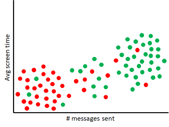
Consider this scenario. You work as a data analyst for a company that has developed a fitness accountability app. During the first week of January, the company experienced a large number of new app installs. These installs are presumably from people looking to fulfill their new year resolution fitness goals. At the end of the month you gathered a week’s worth of activity data from several of these new users. Below is a scatter plot of this data.
Data points in red represent users who deleted the app after 1 week of usage. The data points in green are users who are still actively using the app. From the plot it is clear that there’s a relationship between level of app engagement and likelihood to churn. Users furthest to the left are more likely to delete the app after a week, while users furthest to the right are more likely to remain active on the app. A high degree of uncertainty, however, exists for users in the middle of the plot. These users could either churn or remain active.
Let’s now suppose you were given the task to group these users into a “churn” and “not churn” categories. You could use a clustering method like K-means to group the users, but information about the degree of uncertainty in the categories would be lost. A new clustering method is needed that would allow you to model the degree a data point is similar to or dissimilar from users that churn and remain active.
Enter Fuzzy C Means Clustering
C Means is a k-means variation that assigns each data point probabilities of belonging to each cluster. C Means differs from k-means in two key ways:
The first difference is that c means constructs a table (i.e. matrix) that contains the probability that each datapoint belongs to a particular cluster. Here’s what the table would look like for a few data points in the problem outlined above:
User
Churn
Not Churn
A
0.25
0.75
B
0.91
0.09
C
0.51
0.49
D
0.17
0.83
Each entry in the table has a number between 0 and 1. The larger the number, the more likely that data point belongs to the cluster. The sum of probabilities for each datapoint must also equal 1. If you look at the probabilities for each data point in the data table above, you will see that they indeed do.
This table, which we will call the fuzzy partition table, is randomly initialized at the start of c-means algorithm and then repeatedly updated, along with the centroid. Each entry in the table is updated using the following equation:
dist(xi,cj) and dist(xi,cq) represents the Euclidean distance between a datapoint xi and a cluster centroid cj and between xi and cq. You may have also noticed the m exponential term in the numerator and denominator. This is a special parameter that controls the fuzziness of the results. When m is 0, the equation will produce a binary output (1 or 0), akin to what you’d get if K-means was applied. As a matter of fact, you can think about K-means as C-means with the m parameter set to 0. The larger m is the fuzzier the output is.
The second key difference lies in the calculation of the centroid on each iteration of the algorithm. The formula is as follows
If you read my previous post on weighted kmeans, you’ll notice that this is essentially the weighted mean.
With that, here’s the steps of the C means algorithm:
Choose c, the number of clusters, and m
Randomly select c data points from the dataset to be initial centroids
Randomly choose values for each entry in the fuzzy partition table, subject to the constraint that the values sum to 1.
Compute new centroids
Update the fuzzy partition table
Repeat step 4 and 5 until either there’s no change in the values in the table or the difference is smaller than some threshold.
Choosing the C in C-Means
For C means you can use the Elbow method to find the optimal value for c. Below is a modified version of SSE to use when choosing the optimal value for c.
That’s all folks!
In my next post I will discuss methods for clustering high dimensional data.
You will often need to perform some form of preprocessing on your dataset before running a data clustering algorithm. In this post I will introduce one important preprocessing method that is often overlooked when clustering data. That method, my friends, is called data scaling.
What is data scaling?
As you may already know, clustering algorithms work by computing distances (i.e. dissimilarities) between data points in the dataset and grouping together points that are close in proximity. The method used for calculating the distance will be different depending on the algorithm used. One trait most of these methods share is high sensitivity to attributes (also called features) with numerically larger values compared to other attributes in a dataset. These features will bias the distance calculations and can cause the clustering algorithms to produce subpar clusterings.
To illustrate this, let’s say you have a dataset containing SAT and GPA scores for 5000 college students that you’d like to segment into 4 groups.
Student
SAT
GPA
1
1419
1.35
2
1384
1.16
3
784
3.58
4
748
3.31
5
1124
0.98
…
…
…
4996
683
2.02
4997
739
3.58
4998
741
3.21
4999
1088
1.01
5000
595
1.60
After running K-means on the dataset, you create a scatter plot showing the student scores and the clusters each student is assigned to.
It’s immediately apparent looking at the plot that a large number of students were mislabeled by the algorithm. SAT scores have a significantly larger numerical scale (400 to 1600) than that of grade point averages (0 to 4). SAT scores therefore have a much larger influence on the distance measurement K-means uses to group the students.
As can be seen from the plot, K-means leaned heavily on the SAT scores to cluster the data. To ensure that both GPA and SAT has an equal weight in the clustering both features need to be transformed so they are on the same scale. This is exactly what data scaling is for.
Here’s the scatter plot we get after scaling the data set and performing k-means:
Student clusters after applying data scaling
Data Scaling Techniques
There are two main methods for scaling data. The first method is called normalization and the second method is called standardization.
Normalization
Normalization uses the minimum and maximum to transform features onto the same scale. Below is the formula used to normalize each feature:
Here’s what the student scores dataset would look like when each feature is normalized:
Student
SAT
GPA
1
0.849167
0.3375
2
0.820000
0.2900
3
0.320000
0.8950
4
0.290000
0.8275
5
0.603333
0.2450
…
…
…
4996
0.235833
0.5050
4997
0.282500
0.8950
4998
0.284167
0.8025
4999
0.573333
0.2525
5000
0.162500
0.4000
Normalization rescales the dataset features between 0 and 1 or -1 and 1. Normalization is typically used when the numerical distribution of the features is not known. Normalization fails however on datasets with outliers. Allow me to explain why.
Suppose you have a small dataset containing the following points.
X
Y
0
1
2
3
5
3
10
13
15
17
20
30
22
23
24
19
990
25
1000
27
As you can see from the table, the last two data points are outliers. Using normalization, the data points will transform into the following
X
Y
0.000
0.000
0.002
0.083
0.005
0.083
0.010
0.500
0.015
0.666
0.020
0.458
0.022
0.583
0.024
0.708
0.990
0.833
1.000
1.000
Even though normalization shifts the values between 0 and 1, the outliers still remain as outliers. If we were to compare these points using a distance function, the [] feature would have more influence on the measurement.
Standardization
Standardization uses the mean and standard deviation to transform a dataset. The formula for transforming each feature is shown below:
Here, µ is the mean of the feature and σ is the standard deviation of the feature. This is what the same student score dataset from earlier would look like when standardized.
Student
SAT
GPA
1
1.393781
-0.447397
2
1.283359
-0.634040
3
-0.609587
1.743211
4
-0.723163
1.477980
5
0.463083
-0.810861
…
…
…
4996
-0.928232
0.210768
4997
-0.751557
1.743211
4998
-0.745248
1.379747
4999
0.349506
-0.781391
5000
-1.205864
-0.201813
Standardization is very helpful in cases where the features in the dataset are normally distributed. But your data doesn’t necessarily have to be normally distributed in order to use standardization. Unlike normalization, standardization does not squeeze your data into a bounding range, meaning that it will still work if there’s outliers present.
That’s all, folks!
There are many other data scaling techniques that can be used, but normalization and standardization are the two methods that are mainly used in practice. In my next post I will discuss fuzzy clustering.
In my previous post on the K-Prototypes algorithm, I introduced the concept of parameter weighting. With just a single parameter, you can control the amount of influence categorical attributes has on the data clustering. In this post, I’m going to expand on this concept and show how we can control the weightings of entire data points. There are some data clustering problems you will encounter in the real world where this technique is essential.
Customer Segmentation Case Study
Consider the following scenario. You were hired by a growing online distributor of flavored milk to help them understand the shopping habits of their customers. The company would like to segment their customers into different groups. In particular, the company would like to understand the representative spend share for each customer group it can effectively firm up its marketing strategy. You are handed a dataset containing the percentage of sales in five different milk products over the past year.
CustomerID
Organic Milk
Condensed Milk
Almond Milk
Coconut Milk
Skim Milk
1
13.45
26.05
11.14
4.99
27.44
2
24.73
19.52
16.58
3.49
23.65
3
25.50
20.47
18.14
2.66
23.49
4
4.5
20.10
7.36
9.27
13.47
5
26.47
21.09
18.4
1.90
21.75
6
9.43
15.37
11.89
1.78
25.81
7
4.83
21.11
5.48
9.47
13.80
8
5.76
18.09
7.42
9.91
11.25
9
5.36
18.27
4.84
9.97
13.01
10
7.99
20.17
6.63
7.9
12.39
…
…
…
…
…
…
Customer segmentation problems such as this one is an excellent use case for K-means clustering. The centroids (i.e. center points) produced by k-means can provide the representative customer characteristics that your client is looking for. Taking a look at the distribution of total spend for each customer, you notice that the numbers are heavily skewed.
Some customers a high spend share in one or more categories, but their total spend is so low that they are less likely to respond to the company’s marketing campaign. Because K-means weighs each data point evenly, it will not take the customer total spend into account and will produce clusters and center points that are misleading.
In order to get the output we’re looking for, we need to weigh each customer differently. Customers who have a higher total spend should have more influence on the cluster centroids than customers who do not. This is exactly what weighted k-means clustering allows us to do.
About Weighted K-means clustering
To perform weighted k-means clustering, we need to make a minor tweak to the way the cluster centroids are calculated after each iteration. Instead of using the mean the calculate the centroids, we use the weighed mean:
Each data point xi in the dataset is assigned a weighted value wi. Computing the weighted mean for a cluster is just a matter of:
Multiplying each data point by its weight
Computing the sum the products calculated in step 1 together, and
Dividing the sum calculated in step 2 by the sum of all the weights.
As usual, here’s the weighted k-means clustering procedure, taking in account the new centroid calculation discussed above:
Choose k. Determine the number of clusters to form
Select initial centroids. In this step the algorithm chooses k data points from the dataset at random to be the initial centroids.
Assign data points to a centroid. In this step the algorithm calculates the Euclidean distance between each data point and each centroid. Data points are assigned to the centroid with the smallest distance.
Calculate weighted centroids. New centroids are calculated by finding the weighted mean of each cluster
Repeat steps 3 and 4. Repeat steps 3 and 4 until no changes in the assignments are made.
Weighted K-means and Outliers
Weighed k-means clustering is also useful when clustering datasets with outliers. By assigning small weight values to outlier data points, k-means will form clusters that are robust to these extreme values.
That’s all folks!
I hope you found this guide on weighted k-means useful. In my next post, I will discuss data scaling, an important but often overlooked concept that has a huge impact on the data clustering algorithms.
This blog has thus far covered a number of data clustering algorithms. A majority of the algorithms operate under the assumption that the dataset to be clustered is purely numerical. The k-Modes algorithm was the one method we’ve covered that works on purely categorial data. What if you want to cluster a dataset that contains both categorial and numeric data. That’s exactly what the k-prototypes algorithm allows you to do.
What is a Prototype?
In K-Means, the centroids are found by calculating the mean of each cluster’s data points. In K-Modes, these are derived from the mode. For datasets with mix of categorical and numerical data, the centroids are found by calculating the mean of the numeric data and taking the mode of the categorial data. A prototype is simply a combination of the mean and the mode.
City
Eye Color
Age
Score
Miami
Blue
32
93
Miami
Green
25
32
Chicago
Black
27
72
Miami
Blue
21
63
Prototype
Miami
Blue
26.25
65
The function that is used to check how similar or different each data point is to a prototype is also a combination of the Euclidean distance from K-Means and the matching function from K-Modes:
Let’s take this function apart and examine what each piece means:
The red part of the function above is the k-means Euclidean measurement, and the green part is the k-modes matching dissimilarity measurement.
The symbols p and q in the function above represent two individual data points.
N and C represent sets of numeric and categorial variables and n and c represent a variable from both sets. The symbols pn, qn, pc, qc represent an numeric and categorial values.
Something new you might have also noticed is the gamma term:
This term controls the amount of weight categorial variables contribute to the output.
A large enough value for gamma would result in more focus being placed categorial variables. As a result, a point could be assigned to a cluster where the cluster’s prototype is not nearest to it in terms of numeric variables, but the categorial values of most of the other points in the cluster matches that point.
Here’s an example of the dissimilarity function in action using two data points:
City
Eye Color
Age
Score
p
Miami
Black
32
93
q
Chicago
Black
27
72
From the function above, N would represent a set containing the numeric variables {Age, Score}, and C is a set containing categorial variables {City, Eye Color}.
Calculating the Euclidean (red) part of the function, we get the following:
For the matching (green) part of the function, lets suppose that gamma is set to 1.5. Here’s what we’d get:
Adding the results from both calculations together, the final result is 23.08.
Here’s the step by step breakdown of the k-prototypes procedure, taking into account everything covered so far:
Choose k and gamma. Determine the number of clusters to form and the amount of weight categorial variables should have on the clustering.
Select initial prototypes. In this step the algorithm chooses k data points from the dataset at random to be the initial prototypes.
Assign data points to a prototype. In this step the algorithm calculates the dissimilarity between each data point in the dataset and each prototype and assigns the data point to the prototype it is closest to.
Calculate new prototypes. A new prototype is calculated for each cluster using the dissimilarity function described earlier.
Repeat steps 3 and 4. The algorithm reassigns data points to clusters based on how close they are to the new prototypes. After the reassignment new prototypes are computed. This process is repeated until no changes in the assignments are made.
Determining Optimal Number of Clusters
Like all the other methods covered before this one, the Elbow method can be used to determine optimal number of clusters. Here’s the new cost function you will be using for the elbow plot:
As you might have guessed, this is simply a combination of the sum of squared error from k-means and the total dissimilarity score from k-modes.
But wait, what about optimal values for gamma?
With the addition of the gamma term, you might be wondering if there’s a method for finding good values for that parameter. Finding optimal values involves pure experimentation. You perform k-prototypes on your dataset several times with different values and choose a value that weighs the categorical and numeric attributes in the way you expect.
If you’re looking for a quick and dirty value that provides a decent balance between the categorical and numeric attributes in your dataset, a good heuristic you can use is the standard deviation of the numeric attributes in the dataset. Z. Huang, in his early experiments with the k-prototypes algorithm, found a suitable value to lie between 1/3 and 2/3 of the standard deviation of the numeric data. Here’s a link to his paper where he describes the experiments more in detail.
That’s all, folks!
I hope you enjoyed this tutorial. One thing that was new with this segmentation method was the usage of a gamma paramter to control the influence variables have on the output. In my next post I will cover another clustering algorithm that also makes use of weights. Stay tuned.
K-Medoids is a data clustering algorithm that is commonly used on datasets containing extreme values. In previous posts on the subject, I covered two implementations of the algorithm that can be used to find medoids in a dataset.
The first method, called PAM, scans every data point in the dataset for k medoids. PAM can accurately locate the medoids in the dataset, but at expense of efficiency on large datasets.
CLARA was the second method I covered. It’s able to achieve superior performance on large datasets by restricting the scan to a smaller randomly sampled portion of the dataset. An issue that may arise with CLARA, however, is that the true medoids of the dataset might get excluded from the sample, causing the method to return sub-optimal results.
This is where the next algorithm I will discuss comes into play. This algorithm, like CLARA, does not check every data point in the dataset. But unlike CLARA, its scan is not restricted to a small sample of data points, but at random neighborhoods of points selected at multiple iterations. This method is called CLARANS, which is short for Clustering LARge Applications based on RANdomized Search.
The Search For the Best Medoids Data Clustering
The CLARANS clustering algorithm starts out just like any other k clustering method. K data points are chosen at random to be the medoids that all the other data points in the data set will cluster around. From there, CLARANS searches for neighboring medoids that cluster the data better. A better clustering is defined as a set of medoids where the total dissimilarity between each medoid and the data points assigned to it is as small as possible.
For the sake of making this process CLARANS takes to search for better medoids easier to understand, I want you to imagine that you are standing in a large room littered with dozens of water filled holes. You and your friends are playing a game where you are tasked with finding the deepest hole in the room. The catch is that this has to be done blindfolded.
Each hole in the room represents a set of k data points from the dataset chosen at random.
After your friends place you at one of the holes, you begin your task for looking for the deepest hole in the room. Because you’re unable to determine this visually, you do this by sticking your bare foot into the holes and measuring the depth by how high the water rises up your leg. The depth a hole represents the total cluster dissimilarity for that set of k medoids.
You make a mental note of the depth of the hole that’s in front of you and then randomly choose one of the nearby holes to measure next.
In the case of the CLARANS clustering algorithm, two sets of k medoids are neighbors if they share all but one medoid.
Neighboring set of k-medoids, where k = 7
CLARANS selects a neighbor by randomly selecting one of the k medoids from the dataset and replacing it with a data point from the dataset. From there it computes the total cluster dissimilarity of the neighbor and compares it with the dissimilarity of the current set of medoids.
CLARANS searches several neighbors, keeping track of the best set of mediods it finds thus far. The maximum number of neighbors that is searched is actually predetermined at the beginning of the algorithm. We’ll call this parameter maxneighbors. Each time CLARANS finds a better set of medoids, it searches maxneighbors more neighbors to see if it finds an even better set. If it fails to find a better clustering after examining additional neighbors, the search is concluded. The set of medoids CLARANS settles on is known as a local minima.
The following flow chart below summarizes the local search described above:
CLARANS data clustering local search flow diagram
From Local Search to Global Search
Going back to our toy scenario, after searching several neighboring holes, you were able to find the deepest hole within a the small region of holes that you searched. That hole you found, may not be the deepest hole in the room.
To truly determine this, you decided to repeat your local neighborhood search at other random holes in the room, and compare the deepest hole you found with what you just found. With that your friends proceed to move you to other random holes in the room where you can conduct additional searches for local minimas.
Translating this process to the CLARANS algorithm, the number of local searches that is performed is another parameter that is determined at the start of the algorithm. We’ll call this number numlocal. After performing several of these local searches, CLARANS has a pretty good approximation of the true medoids in the dataset.
The entire CLARANS data clustering process can be summarized with the following steps:
Specify parameters numlocal, k, and maxneighbors.
Let B represent the best k mediods discovered so far.
Let f represent the number of local searches to perform. Set this number to 1.
Let H represent k randomly selected medoids from the data set.
Let c represent the number of neighbors inspected. Set this number to 1.
Let s represent a random medoid from H. Let j represent a data point from the dataset that is not in H. Let N equal a set of k medoids that share the same points as H, except s is replaced by j.
If the total cluster dissimilarity in N is less than that of H, set H to N and go to step 5.
Increment c by 1. If c < maxneighbors, go back to step 6.
If the total dissimilarity of H is less than that of B, set B to H.
Increment f by 1. If f < numlocal, go back to step 4.
Output B.
That’s all, folks!
In the next post, we will be covering a method that can be used to cluster datasets with a mixture of numeric and categorical data. Stay tuned.
Previously I introduced K-Medoids clustering, a data clustering method that can be used to cluster datasets containing outliers. The Partition Around Medoids (PAM) algorithm I described in my post is computationally slow and expensive and is typically used on small datasets because of that. What if we have a very large dataset that we’d like to cluster using K-Medoids. Do we have no other choice but to sit around a wait for the time consuming clustering method to finish? Not at all! In this post I will introduce you to CLARA, a K-Medoids implementation that can be on large datasets. Let’s get started!
CLARA Data Clustering .. PAM, But with A Twist
CLARA is short for Clustering LARge Applications. The PAM Algorithm computes medoids by finding the data point with the shortest distance from all the other points in its cluster. Computing medoids using PAM is very quick for small datasets. But when it comes to much larger datasets, this could take quite a bit of time.
CLARA addresses this issue by performing PAM on a randomly selected sample of data points. We will call the size of this smaller dataset s. The idea behind this approach computing the medoids of this sample would give us an approximation of the medoids if the entire dataset was clustered, assuming that data points from the sample is representative of the entire dataset .
This clustering of sampled data points is performed not once, but several times. In order to ensure that the best possible clustering is achieved, CLARA draws several random samples of data points, performs PAM on each, and then determines the clustering that produces the best results. We will call the number of random samples and clustering performed n.
How does CLARA determine which clustering result is the best, you ask?
That all depends on the dissimilarity (i.e. distance) method that was used to form the clusters. If Euclidean distance was used, than best is defined as the result with the smallest sum of squared error. If Manhattan distance was used, then the total absolute difference is used. See my articles on K-Means, and K-Medians for more information about these measures.
The medoids from the best clustering is then used to assign the data points from the entire dataset to the appropriate cluster.
Dataset before CLARA
Step 1: Sample data points
Step 2: Compute sample medoids
Step 3: Assign data points to medoids
With that, the entire process is outline in the following steps
Select n samples of the dataset, each with the size s.
Perform PAM on each sample
Determine the PAM clustering that produces the most optimal results.
Use the selected PAM clustering to assign each datapoint from the entire dataset to the appropriate centroid.
With the CLARA implementation, we have an approach for efficiently computing approximate medoids for our dataset. There are some disadvantages to this approach:
The quality of the results returned by CLARA is heavily dependent on the data sampled. If it turns out that there was some bias in the selection of the data points, then the clustering results will not be good.
The effectiveness of CLARA also depends on the sample size. CLARA can’t produce a good clustering if any of the medoids sampled is far from the actual medoids. This will most definitely the case if the sample sizes are too small. On the other hand, sample sizes that are too large would result in longer processing times. Therefore, when using CLARA one must choose a sample size that provides an acceptable tradeoff between speed and accuracy.
Coming up next
My next post will cover the CLARANS data clustering algorithm, another K-Medoids implementation. Until next time.
In my last post, I introduced you to the K-Medians algorithm, a data clustering method that can be used to cluster datasets with outliers. In this post I will be introducing you to another k-means variation that is also effective on datasets with outliers. It’s called K-Medoids. As a matter of fact, there are three variations of this clustering method, each with its own advantages and disadvantages. I will be covering just one of these variations in this post. The other two will be covered in subsequent posts.
Introducing the K-Medoids Algorithm
The K-Medoids algorithm, much like the other variations we’ve covered thus far, works and functions similarly to k-means. What makes it different is:
Unlike the other variations we’ve covered up to this point, any distance function can be used to compute dissimilarities between the data points and the cluster centroids. That means you can use Euclidean distance and Manhattan distance. I will be covering more distance functions that you can use for clustering in a future post.
Centroids are computed by finding the medoid of the data points in each cluster. A medoid is a data point from a data set whose average dissimilarity is the smallest. In other words the medoid is the most centrally located point in the dataset. The medoid, like the median, is not influenced by extreme data points. K-Medoids therefore does not suffer from the same limitations as k-means.
PAM data clustering medoids
Partitioning Around Medoids
As I mentioned at the start of this post, there are three variations of k-Medoids clustering. The most common approach, and the one I will be explaining in this post is known as the Partitioning Around Medoids (PAM) algorithm. The algorithm works as follows:
Initialize. Randomly select k data points as centroids.
Assign. Pick any distance method of your choosing and use it to compute the dissimilarity between each data point and the k centroids. Assign each data point to the closest centroid.
Update. Perform the following for each cluster:
Let c represent the cluster centroid, and p represent a non-centroid data point. For each data point:
Swap positions. That is, c becomes p and p becomes c.
Use the distance function you chose in step 2 to compute the average distance between each data point and the centroid.
After computing the average distance for each datapoint, the new centroid becomes the data point with the smallest average distance.
Choosing optimal K
The Elbow method and Sihouette method can be used to find the optimal value of k for K-Medoids. See this post for a description of these methods.
Up Next…
The PAM algorithm is able to accurately compute the medoids for each cluster. But this accuracy comes at a cost. The algorithm is computationally time consuming and this therefore used when the size of the data set is relatively small. For much larger datasets we need to use more efficient methods. I will be discussing one of these methods in my next post. Until next time.